


Your church website is probably the first place people meet your ministry—before they ever walk through your doors on Sunday morning.
When someone searches “church near me” or “Christian church near me,” your website becomes your greeter, your welcome team, and often your first sermon. If it doesn’t immediately answer their questions or make them feel welcome, they’re gone in seconds. No callback. No second chance.
This guide is written for pastors and church leaders who want a church web design that actually serves people—not just looks nice in a portfolio. You’ll learn what makes church websites effective (not just attractive), how to avoid the mistakes that quietly cost you visitors every week, and how to build a site that reflects your mission without breaking your budget.
By the end, you’ll know exactly what your website needs, what it doesn’t, and how to make decisions that honor both your stewardship and your calling to welcome people well.
Your website isn’t a tech project. It’s a ministry tool.
Let’s make sure it works like one.
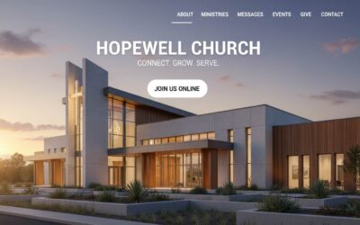
What Makes a Church Website Actually Work?
An effective church website answers three critical questions within 10 seconds: Where are you? When do you meet? What should I expect? It prioritizes first-time visitors over members, displays service times and location prominently on the homepage, uses plain language instead of church jargon, includes a dedicated “New Here” page that reduces visitor anxiety, and works flawlessly on mobile devices where most searches happen.
That’s the core answer.
Here’s what it looks like in practice: Your homepage displays service times and location immediately—no hunting required. You’ve got a “New Here?” page that explains what Sunday mornings are actually like. Your site loads fast on mobile devices. And most importantly, you write every page assuming the reader has never been to church before.
Church websites fail when they’re built for insiders—people who already attend and understand the culture. They succeed when they remove confusion and anxiety for someone who’s nervous about visiting for the first time.
The difference between a working church website and a broken one isn’t budget or design talent. It’s empathy.
Ask yourself: Could a stranger who just moved to your city confidently visit your church using only your website?
If the answer is “maybe” or “probably,” your site needs work.
What successful church websites include:
- Service times visible on homepage (not buried in a menu)
- Full address with embedded Google Map
- Clear “Plan Your Visit” or “New Here” page
- Plain language explanations of programs and ministries
- Mobile-responsive design that works on phones
- Online giving that’s simple and secure
- Contact information that actually gets answered
What they avoid:
- Insider terminology without context
- Vague welcome messages that say nothing specific
- Complex navigation that hides basic information
- Slow page speeds or broken mobile experiences
- Outdated content that suggests the church isn’t active
The goal isn’t to impress other churches or win design awards. The goal is to help real people take their next step—whether that’s attending a service, asking a question, or finding hope.
Why Your Church Website Matters More Than Your Building Sign
Most people searching for a church won’t drive around your neighborhood looking at buildings.
They start on Google.
When someone types “church near me” or “Christian church near me,” they’re not browsing for fun. They’re often in the middle of a life transition—a move, a crisis, a spiritual question. They’re looking for community, answers, or simply a place to belong.
Your website is the first place they’ll meet your church. And they’ll decide whether to visit in about 10 seconds. That’s it.
Here’s what the numbers tell us:
According to research, 68% of people check a church website before attending a service. That means for every three first-time visitors who walk through your doors, two of them visited your website first.
Google processes over 200,000 searches for “church near me” every single month in the United States alone. Add in variations like “Christian church near me,” “churches open Sunday,” and “church service times,” and you’re looking at hundreds of thousands of people searching every week.
If your website doesn’t show up—or shows up but doesn’t answer their questions—you’re invisible to people actively seeking what you offer.
The digital front door is now your primary front door.
Think about it this way: You wouldn’t leave your church building locked with no signage on Sunday morning. But that’s exactly what an unclear or outdated website does to people searching online.
Your physical building might have a sign out front. But your website determines whether anyone ever sees it.
What people are silently asking when they land on your site:
- Where exactly are you located?
- What time is the service, and how long does it last?
- What’s the worship style like—traditional, contemporary, somewhere in between?
- Will I be forced to stand up and introduce myself?
- What happens with my kids during the service?
- How should I dress—suit and tie, or jeans and a t-shirt?
- Is this church safe, welcoming, and legitimate?
If your website doesn’t answer these questions quickly and clearly, visitors leave. Not in anger—just in uncertainty. And uncertainty is enough to make someone choose the church down the street that felt clearer and safer.
This isn’t about marketing. It’s about hospitality.
In biblical terms, your website is an extension of how you welcome strangers. It’s how you remove barriers and invite people into community before they ever arrive.
When you design your church website with first-time visitors in mind, you’re practicing digital hospitality. You’re saying, “We see you. We understand you might be nervous. Here’s everything you need to feel confident walking through our doors.”
That’s not a tech task. That’s ministry.
And it matters more than most churches realize.
8 Non-Negotiable Features for Church Websites in 2026
Every church website needs certain elements to function as an effective ministry tool. But not all features are created equal—and many churches waste time on the wrong things while missing what actually matters.
Here’s what your website must include, explained from a first-time visitor’s perspective rather than a technical checklist.
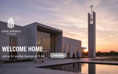
1. Service Times and Location (On the Homepage)
This seems obvious, but you’d be surprised how many churches bury this information.
Service times should be visible the moment someone lands on your homepage. Not in a footer. Not on an “About” page. Right there, above the fold, where someone can see it without scrolling.
Include your full street address—not just the city name. And embed a Google Map that visitors can click to get directions. This helps both people and search engines understand exactly where you’re located.
Why this matters for church SEO: When Google sees consistent location information on your website, it’s more likely to show your church to people searching “church near me” or “churches in [city name].”
Common mistake: Churches list service times like “9am and 11am Sunday” without specifying the time zone. If someone’s searching from across the country because they’re planning a move, this creates confusion.
2. A Dedicated “New Here?” or “Plan Your Visit” Page
This is the single most important page on your website—and most churches either skip it or do it poorly.
A good “New Here” page reduces anxiety. It answers the questions people are too nervous to ask:
- What’s a typical service like? (Order of service, worship style, sermon length)
- How should I dress? (Yes, people genuinely worry about this)
- What happens with kids? (Childcare, check-in process, age groups)
- Where do I park, and which entrance do I use?
- Will I be put on the spot or asked to stand up?
Pro insight: The best churches include photos or a short video showing what Sunday morning looks like. Not a polished promotional video—just a real look at what happens so visitors know what to expect.
Language tip: Replace “Fellowship Hall” with “The large room where we serve coffee before service.” Replace “Life Groups” with “Small groups that meet during the week for Bible study and community.”
Assume your reader has never been to church. Ever.
3. Mobile-Responsive Design (Non-Negotiable)
Over 60% of church website visits happen on mobile devices. If your site doesn’t work flawlessly on phones, you’re losing more than half your potential visitors.
Mobile-responsive means your website automatically adjusts to fit any screen size. Text should be readable without zooming. Buttons should be large enough to tap easily. The site should load in under 3 seconds.
Technical check: Visit your website on your phone right now. Can you find service times in under 10 seconds? Is the text readable? Do all the buttons work? If the answer to any of these is no, your site isn’t mobile-friendly.
Google’s stance: Mobile usability directly affects your search rankings. Sites that work poorly on mobile show up lower in search results—meaning fewer people find you.
You can test your site for free using Google’s Mobile-Friendly Test: https://search.google.com/test/mobile-friendly
4. Clear About and Beliefs Page (Written for Outsiders)
People want to know what your church believes before they visit. But they don’t want to read a seminary thesis.
Your beliefs page should answer: What do you believe about God, Jesus, the Bible, and salvation? Write it in plain language that a middle schooler could understand.
Before: “We ascribe to orthodox Trinitarian theology and affirm the inerrancy of Scripture.”
After: “We believe the Bible is God’s word and teaches us how to know Him. We believe Jesus is God’s son who came to earth, died for our sins, and rose again so we can have a relationship with God.”
Pro tip: Include a denominational identifier if you have one. Many people search for specific traditions—Baptist, Presbyterian, non-denominational, etc. Don’t hide this information.
5. Sermon Library or Online Service Access
Post-pandemic, people expect to access sermons online. Whether that’s through YouTube, a podcast, or an embedded video player on your site, make it easy to find.
This serves two audiences:
- First-time visitors who want to “try before they visit”
- Current members who miss a Sunday or want to revisit a message
You don’t need fancy production. A smartphone recording uploaded to YouTube beats nothing every time.
SEO benefit: Sermon content gives you fresh, keyword-rich material that helps your site rank for searches like “sermons about [topic]” or “[your city] church sermons.”
6. Online Giving Integration
Online giving isn’t about convenience for you—it’s about removing barriers for people who want to support your ministry.
Most church giving platforms (Tithe.ly, PushPay, Planning Center Giving) integrate easily with your website. The process should take less than two minutes and accept credit cards, debit cards, and ACH transfers.
Ministry insight: Recurring giving—where people set up automatic weekly or monthly donations—tends to be more consistent and less affected by attendance fluctuations. Make this option clear and easy to set up.
Trust factor: Display security badges and explain briefly that giving is secure and encrypted. Many people worry about online financial transactions, especially on church websites.
7. Event Calendar with Registration Capability
Your website should list upcoming events—and make it easy for people to register or RSVP.
This includes everything from Sunday services to VBS, community outreach events, classes, and special services. Include dates, times, locations, and a brief description of who the event is for.
Pro feature: Use a calendar plugin that allows people to add events directly to their Google Calendar or iPhone calendar with one click.
8. Contact Information That Actually Works
List multiple ways for people to reach you:
- Phone number (that someone actually answers during business hours)
- Email address (that gets checked daily)
- Physical address for mailings or visits
- Contact form (if you prefer this over publishing emails)
Critical detail: Respond within 24 hours. When someone fills out a contact form or sends an email, they’re testing whether your church is active and cares about new people. A week-long delay sends the message that you don’t.
The 5 Biggest Church Website Mistakes (And How to Fix Them)
Even churches with good intentions make predictable mistakes that quietly cost them visitors every week. Here are the most common problems—and the simple fixes.
Mistake #1: Building for Insiders Instead of Seekers
This is the #1 mistake small churches make, and it’s completely understandable why it happens.
When your communications team or pastor designs the website, they’re thinking about what current members need. Upcoming events. Sermon series announcements. Ministry updates. All of this makes sense to people who already attend.
But first-time visitors don’t care about any of it—not yet.
What this looks like in practice:
- Homepage features an announcement about next week’s potluck
- Navigation menu has items like “Ministries,” “Connect,” “Engage,” “Grow”
- Service information is under “About Us” > “What We Believe” > “Service Times”
- Photos show empty sanctuaries or stock images of hands holding Bibles
The fix:
Design every page with one question in mind: “If a stranger visited this page, would they know what to do next?”
Reorganize your navigation around visitor questions:
- New Here?
- Service Times
- About Us
- Ministries
- Events
- Give
- Contact
Put member-focused content in a members portal or clearly labeled section. Keep the public-facing site focused on people who don’t know you yet.
Mistake #2: Hiding Critical Information
Service times and location are the two most important pieces of information on your website. Yet many churches make visitors hunt for them.
Common hiding places:
- In a footer only visible at the bottom of the page
- On a secondary page three clicks deep
- In paragraph form buried in the “About Us” section
- Mentioned once on the homepage with no repetition on other pages
The fix:
Display service times and address in at least two places on every page:
- Near the top of the homepage (hero section or just below)
- In the footer of every page throughout the site
Make it visually distinct—use a colored box, larger text, or an icon. This information should never require searching.
Mistake #3: Using Church Jargon Without Translation
Every church develops its own language. Life Groups. Connect Teams. Fellowship. Discipleship. These terms mean something to insiders, but they create confusion for outsiders.
Examples that need translation:
“Join us for Fellowship Hour” → “Join us for coffee and conversation after the service”
“Our Discipleship Ministry” → “Bible studies and classes to help you grow in your faith”
“Life Groups meet weekly” → “Small groups that meet in homes during the week for discussion and community”
The fix:
Do a content audit. Read through every page of your website and highlight words or phrases that someone unfamiliar with church culture wouldn’t understand. Then rewrite them in plain language.
Better yet, ask someone who doesn’t attend church to read your site and mark anything confusing.
Mistake #4: Ignoring Mobile Users (or Making Mobile an Afterthought)
More than 60% of church website traffic comes from mobile devices—phones and tablets. If your site doesn’t work well on mobile, you’re failing the majority of your visitors.
Signs your mobile experience is broken:
- Text is too small to read without zooming
- Buttons are too close together or too small to tap accurately
- Navigation menu doesn’t work properly on phones
- Page takes more than 3 seconds to load
- Images are cut off or distorted
- Contact forms are difficult to fill out on small screens
The fix:
Test your website on multiple devices—iPhone, Android, iPad, etc. Better yet, use Google’s Mobile-Friendly Test tool and PageSpeed Insights to identify specific problems.
If your site isn’t mobile-responsive, it’s time for a rebuild. There’s no workaround for this. Mobile-friendliness isn’t optional anymore—it’s the baseline expectation.
Advanced tip: Check your Google Analytics to see what percentage of your visitors use mobile devices. If it’s above 50% (which it likely is), prioritize the mobile experience over desktop.
Mistake #5: Treating Your Website Like a Bulletin Board
Many churches use their website the same way they use a Sunday bulletin—to announce what’s happening this week for people who already attend.
The problem: Your website isn’t for your members. It’s for people who don’t know you yet.
What this looks like:
- Homepage is dominated by announcements about internal events
- Content assumes familiarity with programs, staff names, and locations
- Updates are sporadic—sometimes weekly, sometimes not for months
- Focus is on what’s happening rather than who you are and what to expect
The fix:
Separate member communication from visitor communication. Use email newsletters, a church app, or a members-only section of the website for internal announcements.
Keep the public-facing website focused on:
- Who you are
- What you believe
- When you meet
- What visitors can expect
- How to get connected
Think of your website as your front door, not your bulletin board. Its job is to welcome people in, not to manage the logistics of people already inside.
Ministry reframe: Every page on your website should answer the question, “Why would someone who’s never been to church want to visit us?” If a page doesn’t answer that question, it belongs somewhere else.
Choosing the Right Website Solution for Your Church Budget
This is the decision most pastors agonize over—and the one that church web design companies rarely address honestly.
Should you use a template builder like Wix or Squarespace? A church-specific platform like Subsplash or Church Center? Or invest in a custom WordPress site?
The truth: There’s no universal “best” answer. The right choice depends on your church size, technical comfort, budget, and what you’re actually trying to accomplish.
Here’s the honest breakdown no one else will give you.
Template Website Builders (Wix, Squarespace, Weebly)
Cost: $10-$30/month
Best for: Churches under 100 people with minimal tech skills
Setup time: 1-2 weeks if you do it yourself
What you get:
Template builders offer pre-designed layouts you can customize with drag-and-drop tools. No coding required. You can have a basic site up in a few hours.
They’re legitimately good for small churches that need something simple and can’t afford custom development. You get hosting, security, and basic SEO tools included.
Real limitations:
- Design flexibility is constrained by templates
- Hard to integrate with church management systems (ChMS)
- Limited control over page speed and technical SEO
- You’re locked into their platform—can’t easily move later
- Advanced features (custom forms, complex calendars) cost extra
When this works:
You’re a church plant or small congregation that needs a website fast. You have someone on staff or as a volunteer who’s comfortable with basic tech. Your needs are straightforward—homepage, about page, service info, contact form.
When this doesn’t work:
You’re growing and need integration with giving platforms, ChMS, or event registration systems. You want a unique design that reflects your specific identity. You need technical control for SEO or page speed optimization.
Ministry consideration: Template sites can look generic. If your church has a distinct personality or brand, templates might not serve you well. Visitors can often tell when they’re on a template site—and that can undermine credibility.
Church-Specific Platforms (Subsplash, Pushpay Sites, Church Center)
Cost: $50-$200/month depending on features
Best for: Churches 150-500 people wanting integrated tools
Setup time: 2-4 weeks with their support
What you get:
These platforms are built specifically for churches. They often bundle website, mobile app, giving, and event management into one system.
The advantage: Everything works together. Your giving button connects directly to your donation processor. Your sermon library syncs with your podcast. Your events automatically update across all platforms.
Real limitations:
- Design options are limited to their templates
- Still lacks full customization control
- Expensive compared to basic builders
- You’re dependent on their ecosystem
- If you outgrow them, migration is painful
When this works:
You’re a mid-sized church that wants simplicity and integration more than custom design. You value having one vendor for website, app, and giving. You have a modest budget ($100-200/month) and want professional support.
When this doesn’t work:
You need a highly custom design. You already use different tools for giving, ChMS, or communications and don’t want to switch. You’re a smaller church that can’t justify the monthly cost for features you won’t use.
Ministry consideration: These platforms are built by people who understand church needs. But they’re designed for the average church, not your specific church. If your ministry model is unique or your outreach strategy is distinctive, the cookie-cutter approach might hold you back.
Custom WordPress Solutions
Cost: $2,000-$8,000 upfront, $30-100/month for hosting and maintenance
Best for: Churches 200+ people or any size with specific needs
Setup time: 6-12 weeks with a developer
What you get:
Full design control. Complete technical flexibility. Integration with any tool you want to use. A website that’s truly yours, built exactly how you need it.
WordPress powers 40% of all websites for a reason—it’s endlessly flexible, well-supported, and can scale with you as you grow.
Real limitations:
- Higher upfront cost
- Requires finding a trustworthy developer
- You’re responsible for updates and maintenance (or hire someone)
- Overkill if your needs are simple
When this works:
You’re serious about your online presence and can invest appropriately. You have specific integration needs. You want a site that reflects your unique identity and can grow with you for 5+ years. You have staff or volunteers who can handle basic content updates.
When this doesn’t work:
You need something immediately and can’t wait 2-3 months. You don’t have $2,000-5,000 to invest upfront. Your needs are basic and unlikely to change. No one on your team is comfortable with technology.
Ministry consideration: A custom site is an investment in long-term stewardship. Done right, it serves your ministry for years and can be updated as your needs change. Done poorly, it becomes an expensive burden. Choose your developer carefully.
The Decision Framework Most Churches Need
Ask yourself these questions:
1. What’s your actual budget—not what you wish it was, but what you can genuinely allocate?
- Under $500/year → Template builder
- $600-2,400/year → Church-specific platform
- $3,000+ upfront investment → Custom WordPress
2. How tech-savvy is your team?
- We’re nervous about computers → Church-specific platform with support
- We can figure things out → Template builder or managed WordPress
- We have someone comfortable with tech → Custom WordPress
3. What are you really trying to accomplish?
- Just need something online → Template builder
- Want integrated tools (giving, app, events) → Church platform
- Need specific features or unique design → Custom WordPress
4. Where will you be in 3 years?
- Same size, same needs → Any option works
- Growing significantly → Custom WordPress (easier to scale)
- Uncertain → Church platform (balanced option)
The Mistake Most Churches Make
They choose based on what sounds impressive rather than what actually serves their mission.
A small church of 75 people doesn’t need a $5,000 custom website. That money could fund outreach, missions, or ministry programs.
But a church of 300 people trying to run everything on a $15/month Wix plan is hampering their growth and credibility.
Right-sizing your investment is good stewardship.
What We Recommend for Most Churches
If you’re under 150 people and need something simple: Start with a quality template builder. Spend your money on ministry, not unnecessary tech.
If you’re 150-400 people and growing: Consider a church-specific platform. The integration and support are worth the cost at this stage.
If you’re 400+ people or have unique needs: Invest in custom WordPress. The flexibility and long-term value justify the upfront cost.
The non-obvious insight: Your website decision isn’t permanent. Many churches start with a template, migrate to a church platform as they grow, then eventually invest in custom development. That’s perfectly fine. It’s called phased growth.
Don’t let the perfect be the enemy of the good. Launch something that serves your visitors today, and upgrade when your ministry actually needs it.
Your website should facilitate ministry, not consume ministry resources.
How to Make Sure Google Shows Your Church to People Searching
When someone types “church near me” into Google, you want your church to show up. But church SEO isn’t about gaming algorithms or stuffing keywords into your website.
It’s about making it easy for Google to understand who you are, where you are, and what you offer—so it can connect you with people actively searching for a church.
Here’s what actually works.
Start With Google Business Profile (This Is Critical)
Before you worry about anything else, claim and optimize your Google Business Profile. This is the free listing that shows up when people search for local businesses and churches.
How to set it up:
- Go to google.com/business and claim your church
- Verify your location (Google will mail you a postcard with a code)
- Fill out every field completely—name, address, phone, website, hours, category
- Add photos of your building, services, and community
- Select “Place of Worship” as your primary category
- Add “Christian Church” or your specific denomination as secondary categories
Why this matters: When someone searches “church near me,” Google shows a map with local churches before showing website results. If your Business Profile is incomplete or non-existent, you’re invisible in that map.
Update your profile with service times, special events, and photos regularly. The more active and complete your profile, the higher Google ranks you in local searches.
Optimize for “Church Near Me” Through Clarity, Not Keywords
Google’s algorithm has gotten smarter. It understands context and intent. You don’t need to repeat “church near me” twenty times on your homepage.
Instead, make your location and purpose crystal clear:
On your homepage, include:
- Your full church name
- Your complete street address (not just city)
- Your city and state
- A clear statement like: “Grace Community Church is a Christian church in Austin, Texas serving families in South Austin and surrounding areas”
In your page titles and headings:
- Homepage title: “Grace Community Church | Christian Church in Austin, TX”
- About page title: “About Grace Community Church | Austin, Texas”
- Service times page: “Sunday Service Times | Grace Community Church Austin”
This helps Google understand your location without awkward keyword stuffing.
NAP Consistency (Name, Address, Phone Number)
Google verifies your church by checking if your information matches across the web. If your address is “123 Main St” on your website but “123 Main Street” on Google Business Profile, it creates confusion.
Make sure these match exactly everywhere:
- Your website
- Google Business Profile
- Facebook page
- Any church directories you’re listed in
- Yelp or other review sites
Include your phone number and address in your website footer so it appears on every page.
Page Speed and Mobile Usability Affect Rankings
Google prioritizes websites that load fast and work well on mobile devices. If your site takes more than 3 seconds to load or doesn’t work properly on phones, you’re penalized in search results.
Test your site:
- Google PageSpeed Insights: https://pagespeed.web.dev/
- Google Mobile-Friendly Test: https://search.google.com/test/mobile-friendly
Both are free and give specific recommendations for improvement.
Quick wins for speed:
- Compress images before uploading (use TinyPNG or similar tools)
- Choose a quality hosting provider
- Remove unused plugins or widgets
- Enable caching if using WordPress
Create Content That Answers Real Questions
The best church SEO strategy is answering questions people actually ask.
Common searches that bring people to church websites:
- “What to expect at a church service”
- “What do Christians believe”
- “Church for young families in [city]”
- “Churches with kids programs near me”
- “What to wear to church”
Create pages or blog posts that answer these questions in plain language. Not for SEO—but because these are real questions from real people who need clear answers.
When you write helpful content, Google notices. And more importantly, people notice.
Don’t Obsess Over Rankings
Here’s the truth: Local churches don’t need to rank #1 for “church near me” nationally. You need to show up for people in your city who are actively searching.
That happens through:
- A clear, well-organized website
- An optimized Google Business Profile
- Consistent information across the web
- Fast loading speed
- Mobile-friendly design
- Content that genuinely helps people
The best church SEO is just being clear, honest, and helpful. Google rewards that because people searching for churches need that.
Focus on serving visitors well, and the rankings will follow.
What Good Church Web Design Actually Looks Like
Design principles might sound abstract, but they directly affect whether people trust your church and want to visit.
Here’s what actually matters—explained in practical terms.
Use Real Photos, Not Stock Images
Nothing kills trust faster than stock photos of generic people praying with their hands folded.
Visitors want to see your actual community. Real people. Real gatherings. Real moments from Sunday mornings or community events.
What to include:
- Photos of your congregation (with permission)
- Your actual building and facilities
- Sunday morning services happening
- Kids programs, youth groups, community events
- Your pastoral staff and leadership team
Pro tip: Photos don’t need to be professionally shot. A good smartphone camera works fine. What matters is authenticity, not polish.
People searching for a church want to know: “Will I see people who look like me? Will my family fit in?” Real photos answer that question better than anything you can write.
Choose Readable Typography
Your font choices affect readability more than you realize.
Basic rules:
- Use sans-serif fonts (like Arial, Open Sans, Lato) for body text—they’re easier to read on screens
- Keep body text between 16-18px—anything smaller strains eyes on mobile
- Use no more than 2-3 different fonts throughout your site
- Ensure good contrast between text and background (dark text on light background or vice versa)
Avoid decorative or script fonts for body text. Save those for headings if you use them at all.
If someone over 50 can read your site comfortably on their phone, you’ve chosen well.
Keep Navigation Simple (The 7-Item Rule)
Your main navigation menu should have no more than 7 items. Ideally 5-6.
Essential menu items:
- New Here (or Plan Your Visit)
- About
- Service Times
- Ministries
- Events
- Give
- Contact
Everything else can go in submenus, footer menus, or secondary navigation.
Why this matters: When faced with too many choices, people choose nothing. Simple navigation makes it easy for visitors to find what they need without feeling overwhelmed.
Prioritize Page Speed (3-Second Rule)
If your website takes longer than 3 seconds to load, you lose 40% of visitors before they see anything.
What slows sites down:
- Huge image files (compress them before uploading)
- Too many plugins or scripts running
- Poor hosting
- Unoptimized code
Quick fix: Use tools like TinyPNG or ImageOptim to compress images to 200-300KB or less before uploading. This single change often cuts load time in half.
Design for Accessibility
Accessible design means everyone can use your site—including people with visual impairments, hearing loss, or motor difficulties.
Basic accessibility checklist:
- Sufficient color contrast (dark text on light backgrounds)
- All images have alt text descriptions
- Video content includes captions
- Site can be navigated with keyboard alone
- Text can be resized without breaking the layout
Tools like WAVE (wave.webaim.org) can scan your site and identify accessibility issues for free.
Ministry perspective: Accessibility isn’t just compliance—it’s hospitality. Making your site usable for everyone reflects the gospel’s welcome to all people.
Choose Colors That Support Your Message
Colors communicate emotion and tone before people read a single word.
Common church color approaches:
- Traditional: Navy, burgundy, gold—conveys stability and heritage
- Contemporary: Bright blues, greens, oranges—conveys energy and approachability
- Minimalist: Black, white, one accent color—conveys clarity and focus
There’s no “right” choice, but your colors should match your church’s personality and the community you’re trying to reach.
One rule: Ensure text is readable against background colors. Light gray text on white backgrounds might look modern, but if people can’t read it, it doesn’t work.
White Space Is Your Friend
White space (empty space around text and images) makes your site feel clean and easy to navigate.
Cluttered designs overwhelm visitors. Generous spacing helps people focus on what matters.
Practical application:
- Don’t cram everything above the fold
- Give images room to breathe
- Use line spacing that makes text comfortable to read
- Break up long content with space between sections
Think of white space like silence in a conversation—it gives people room to process what you’re saying.
Consistency Creates Trust
Use the same fonts, colors, button styles, and layouts throughout your site. Consistency signals professionalism and attention to detail.
When every page looks different, visitors subconsciously wonder if your church is organized and stable.
Design consistency doesn’t mean boring. It means coherent—like your church has a clear identity and knows who it is.
Keeping Your Church Website Fresh Without Overwhelming Staff
Most church websites start strong and slowly decay. Events from two years ago. Outdated staff photos. Broken links. Content that makes visitors wonder if the church is still active.
The problem isn’t laziness—it’s lack of systems.
Here’s how to maintain your website without it becoming a burden.
The 15-Minute Weekly Update
Set aside 15 minutes every Monday (or whatever day works) to update your site.
Weekly checklist:
- Update homepage with this week’s sermon title/topic
- Check that service times are current (holiday schedules change)
- Add any new events to the calendar
- Remove past events
- Verify contact forms are working (test by submitting one)
That’s it. Fifteen minutes keeps your site feeling current and active.
Pro tip: Assign this to one person—not a committee. Committees delay updates and create bottlenecks. One person with clear authority can keep things moving.
The Annual Content Audit
Once a year, review your entire website with fresh eyes.
Questions to ask about every page:
- Is this information still accurate?
- Would a first-time visitor understand this?
- Does this reflect who we are now, or who we were three years ago?
- Can I delete or combine this with another page?
Delete outdated content ruthlessly. Out-of-date information is worse than no information—it signals neglect.
Practical approach: Print out your site map. Check off each page as you review it. Mark pages that need updates. Schedule time to make changes.
When to Redesign vs. Refresh
You don’t need a full redesign every year. But you do need periodic updates.
Redesign (every 3-5 years):
- Site looks dated compared to modern standards
- Navigation structure no longer makes sense
- Technology is outdated (not mobile-friendly, slow, security issues)
- Your church has changed significantly (merger, rebrand, new direction)
Refresh (every 1-2 years):
- Update photos to current events and people
- Revise copy to reflect current programs
- Add new features (online giving, livestream, etc.)
- Improve existing pages based on user feedback
Most churches need refreshes more often than redesigns.
Training Volunteers vs. Hiring Help
You have three options for website maintenance:
Option 1: Train a volunteer Best for: Churches under 200 people with tech-savvy members
Have someone on staff or in leadership train a volunteer on basic updates—changing text, uploading photos, adding events. This works if your website platform is user-friendly and the volunteer is reliable.
Risk: Volunteers move, get busy, or lose interest. Have a backup person trained.
Option 2: Hire part-time help Best for: Churches 200-500 people with modest budgets
Pay someone 2-5 hours per week to handle updates. Could be a college student, a remote contractor, or a part-time staff member.
Budget: $50-200/week depending on skill level and your location.
Option 3: Ongoing retainer with your developer Best for: Churches 500+ people or those with complex needs
Pay your web developer or agency $200-500/month for ongoing maintenance, updates, security patches, and technical support.
This makes sense when your site is complex, integrates with multiple systems, or requires professional oversight.
Most practical approach: Start with Option 1. Move to Option 2 as you grow. Consider Option 3 only when your website is critical infrastructure.
Security and Backup Essentials
Church websites get hacked more often than you’d think—not because hackers target churches specifically, but because many church sites have weak security.
Non-negotiable security basics:
- Keep your platform/CMS updated (WordPress, plugins, etc.)
- Use strong passwords (consider a password manager like 1Password or LastPass)
- Enable two-factor authentication on admin accounts
- Install an SSL certificate (the padlock in the address bar—most hosts provide this free)
- Backup your site weekly (most hosting plans include automatic backups)
If you’re on WordPress: Install a security plugin like Wordfence or Sucuri. These monitor for suspicious activity and block common attacks automatically.
Test your backups: Once a quarter, verify that your backups actually work. Download a backup file and confirm it contains your site content.
Most churches never think about security until they’re hacked. Prevention takes 30 minutes of setup and saves weeks of recovery work.
How to Know If Your Church Website Is Actually Working
Traffic numbers don’t tell you much. A thousand visitors means nothing if none of them attend your church or get connected.
Here’s what actually indicates a healthy, effective church website.
Listen to First-Time Visitors
The most valuable feedback comes from people who just visited your church for the first time.
Questions to ask:
- How did you hear about us? (If they say “your website,” pay attention)
- Was the website helpful in preparing for your visit?
- Was there anything confusing or missing that you wished was there?
- Did you visit the website before coming, and what information were you looking for?
This qualitative feedback tells you what’s working and what’s not—better than any analytics dashboard.
Practical tip: Train your welcome team to ask these questions naturally. Don’t make it feel like a survey—just genuine curiosity about their experience.
Google Analytics Basics (What Actually Matters)
If you have Google Analytics installed (you should), focus on these metrics:
Most visited pages: Shows what people care about most. If your “New Here” page gets high traffic, that’s good—it means visitors are trying to learn about you.
Mobile vs. desktop traffic: If 60%+ of your traffic is mobile and your site isn’t mobile-friendly, you’ve identified the problem.
Average time on page: If people spend 10 seconds on your homepage and leave, either your site loads slowly or doesn’t answer their questions. If they spend 2+ minutes, you’re doing something right.
Traffic sources: Where do visitors come from? Google search? Facebook? Direct visits? This tells you which outreach efforts are working.
Don’t obsess over these numbers. Check them monthly to spot trends, not daily to chase perfection.
“Plan Your Visit” Page Engagement
This is your highest-intent page—people viewing it are seriously considering attending.
Track:
- How many people visit this page (absolute number)
- What percentage of overall visitors view it (should be 15-30%)
- Whether it’s linked prominently from your homepage
If this page gets low traffic, make it more visible. If it gets high traffic but low conversions (people don’t actually visit), the page content might need work.
Form Submissions and Contact Attempts
Count how many people:
- Fill out your contact form
- Submit prayer requests
- Register for events
- Sign up for your newsletter
These are action-takers—people moving from curious to connected.
If these numbers are low or declining, your calls-to-action might not be clear enough, or your forms might be too complicated.
The Simple Test That Tells You Everything
Ask someone who doesn’t attend your church—ideally someone who isn’t particularly religious—to visit your website and complete one task:
“Find out when the service is and where the church is located.”
Watch them try. Don’t help. Just observe.
If they struggle, your site needs work. If they find the information in under 30 seconds, you’re on the right track.
This test reveals more than months of analytics ever will.
Success Looks Different for Every Church
A church of 50 people doesn’t need hundreds of website visitors per week. A church of 500 does.
A church plant might measure success by whether their 10 monthly first-time visitors all found them via the website. An established church might care more about keeping members informed.
Define success based on your context, not someone else’s metrics.
The real question: Is your website helping people move from curious to connected? If yes, it’s working. If no, you know what to fix.
Your Website Is Ministry, Not Marketing
Church web design isn’t about building the flashiest site or following the latest trends. It’s about removing barriers between people searching for hope and the community you’re building to serve them.
When you design your website for first-time visitors instead of insiders, use plain language instead of church jargon, and make information easy to find on mobile devices, you’re practicing digital hospitality. You’re saying, “We see you. We understand you might be uncertain. Here’s everything you need to feel confident taking the next step.”
The churches that succeed online aren’t the ones with the biggest budgets or the best technical skills. They’re the ones that remember their website serves people—not institutions. Every page, every word, every design choice should answer one question: “Does this help someone who doesn’t know us yet feel welcome?”
Your website doesn’t need to be perfect. It needs to be clear, honest, and kind.
Start with one page—your “New Here” page. Write it like you’re talking to someone who’s nervous about visiting. Answer their questions before they have to ask. Remove their fear instead of adding to it.
That’s not just good web design. That’s the gospel made visible in pixels and paragraphs.
And it matters more than most churches realize.
0 Comments